
Radio buttons are a popular element in web forms that allow users to select one option from a list. While default radio buttons have a simple design and limited customization options, with the power of HTML and CSS, you can create custom radio buttons that better match your website’s design and enhance the overall user experience. In this article, you will learn how to create Custom Radio Buttons In HTML & CSS.
Creating custom radio buttons in HTML is a fairly simple process. We start by creating a regular radio button using the <input> tag. This creates a default radio button with a circular shape and a checkmark inside. We can then add a custom “value” attribute to each radio button, which allows us to give it a unique label or name.
How To Create Custom Radio Buttons In HTML & CSS
Create a Folder: Start by creating a folder for your project. You can name it anything you like. Inside this folder, you’ll need to create the following files:
- index.html (for the structure of your Custom Radio Buttons)
- style.css (for styling the Custom Radio Buttons)
Create the HTML File:
- Name your HTML file index.html.
Create the CSS File:
- Name your CSS file style.css.
Step 1: Creating Structure of Custom Radio Buttons
We need to first create the basic structure of our custom radio buttons using HTML
<!DOCTYPE html>
<!-- NotArena || www.NotArena.com -->
<html lang="en">
<head>
<meta charset="UTF-8">
<meta name="viewport" content="width=device-width, initial-scale=1.0">
<title>Custom Radio Button</title>
<link rel="stylesheet" href="style.css">
<style id="wpr-lazyload-bg-container"></style><style id="wpr-lazyload-bg-exclusion"></style>
<noscript>
<style id="wpr-lazyload-bg-nostyle">.elementor-1911 .elementor-element.elementor-element-2e43d051::before, .elementor-1911 .elementor-element.elementor-element-2e43d051 > .elementor-background-video-container::before, .elementor-1911 .elementor-element.elementor-element-2e43d051 > .e-con-inner > .elementor-background-video-container::before, .elementor-1911 .elementor-element.elementor-element-2e43d051 > .elementor-background-slideshow::before, .elementor-1911 .elementor-element.elementor-element-2e43d051 > .e-con-inner > .elementor-background-slideshow::before, .elementor-1911 .elementor-element.elementor-element-2e43d051 > .elementor-motion-effects-container > .elementor-motion-effects-layer::before{--wpr-bg-a755f306-8394-4bf7-99ab-634bdc5c5bd1: url('https://notarena.com/wp-content/uploads/2024/10/BG.png');}.lazyloading{--wpr-bg-9803612e-7904-4058-b833-fbcc7210cf90: url('https://notarena.com/wp-content/plugins/wp-smushit/app/assets/images/smush-placeholder.png');}</style>
</noscript>
<script type="application/javascript">const rocket_pairs = [{"selector":".elementor-1911 .elementor-element.elementor-element-2e43d051, .elementor-1911 .elementor-element.elementor-element-2e43d051 > .elementor-background-video-container, .elementor-1911 .elementor-element.elementor-element-2e43d051 > .e-con-inner > .elementor-background-video-container, .elementor-1911 .elementor-element.elementor-element-2e43d051 > .elementor-background-slideshow, .elementor-1911 .elementor-element.elementor-element-2e43d051 > .e-con-inner > .elementor-background-slideshow, .elementor-1911 .elementor-element.elementor-element-2e43d051 > .elementor-motion-effects-container > .elementor-motion-effects-layer","style":".elementor-1911 .elementor-element.elementor-element-2e43d051::before, .elementor-1911 .elementor-element.elementor-element-2e43d051 > .elementor-background-video-container::before, .elementor-1911 .elementor-element.elementor-element-2e43d051 > .e-con-inner > .elementor-background-video-container::before, .elementor-1911 .elementor-element.elementor-element-2e43d051 > .elementor-background-slideshow::before, .elementor-1911 .elementor-element.elementor-element-2e43d051 > .e-con-inner > .elementor-background-slideshow::before, .elementor-1911 .elementor-element.elementor-element-2e43d051 > .elementor-motion-effects-container > .elementor-motion-effects-layer::before{--wpr-bg-a755f306-8394-4bf7-99ab-634bdc5c5bd1: url('https:\/\/notarena.com\/wp-content\/uploads\/2024\/10\/BG.png');}","hash":"a755f306-8394-4bf7-99ab-634bdc5c5bd1","url":"https:\/\/notarena.com\/wp-content\/uploads\/2024\/10\/BG.png"},{"selector":".lazyloading","style":".lazyloading{--wpr-bg-9803612e-7904-4058-b833-fbcc7210cf90: url('https:\/\/notarena.com\/wp-content\/plugins\/wp-smushit\/app\/assets\/images\/smush-placeholder.png');}","hash":"9803612e-7904-4058-b833-fbcc7210cf90","url":"https:\/\/notarena.com\/wp-content\/plugins\/wp-smushit\/app\/assets\/images\/smush-placeholder.png"}]; const rocket_excluded_pairs = [];</script></head>
<head>
<body>
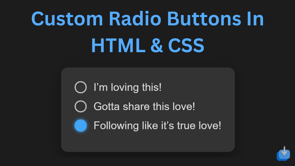
<div class="custom-radio-group">
<label class="custom-radio">
<input type="radio" name="option" checked>
<span class="radio-button"></span>
I’m loving this!
</label>
<label class="custom-radio">
<input type="radio" name="option">
<span class="radio-button"></span>
Gotta share this love!
</label>
<label class="custom-radio">
<input type="radio" name="option">
<span class="radio-button"></span>
Following like it’s true love!
</label>
</div>
<script>var rocket_beacon_data = {"ajax_url":"https:\/\/notarena.com\/wp-admin\/admin-ajax.php","nonce":"151665f498","url":"https:\/\/notarena.com\/code-library\/custom-radio-buttons-in-html-css","is_mobile":false,"width_threshold":1600,"height_threshold":700,"delay":500,"debug":null,"status":{"atf":true,"lrc":true},"elements":"img, video, picture, p, main, div, li, svg, section, header, span","lrc_threshold":1800}</script><script data-name="wpr-wpr-beacon" src='http://notarena.com/wp-content/plugins/wp-rocket/assets/js/wpr-beacon.min.js' async></script></body>
</html>
HTML Structure: Each custom radio button is wrapped in a label, containing an input of type radio, followed by a span acting as the visual part of the radio button.
Step 2: Styling Custom Radio Buttons
Now, we can start creating our custom radio button design using CSS
					  box-sizing: border-box;
    margin: 0;
    padding: 0;
    font-family: Arial, sans-serif;
}

body {
    background-color: #1c1c1c;
    display: flex;
    justify-content: center;
    align-items: center;
    height: 100vh;
}

.custom-radio-group {
    background-color: #333;
    padding: 20px;
    border-radius: 10px;
    box-shadow: 0 8px 20px rgba(0, 0, 0, 0.3);
    max-width: 300px;
}

.custom-radio {
    display: flex;
    align-items: center;
    margin-bottom: 10px;
    color: #ddd;
    font-size: 16px;
    cursor: pointer;
}

.custom-radio input {
    display: none;
}

.radio-button {
    width: 18px;
    height: 18px;
    border-radius: 50%;
    border: 2px solid #bbb;
    display: inline-block;
    margin-right: 10px;
    transition: border 0.3s, background-color 0.3s;
}

.custom-radio input:checked + .radio-button {
    border-color: #42a5f5;
    background-color: #42a5f5;
    box-shadow: 0 0 5px #42a5f5;
}

.custom-radio:hover .radio-button {
    border-color: #fff;
}

.custom-radio input:checked:hover + .radio-button {
    background-color: #66bb6a;
    border-color: #66bb6a;
    box-shadow: 0 0 5px #66bb6a;
The radio buttons glow with a color when hovered or selected. You can change the color values as per your design preferences (e.g., purple, orange, etc.).
With the endless possibilities in design, custom radio buttons are a great component to add to any webpage. So why settle for the default, boring radio buttons when you can easily create and customize your own? Try it out and see the difference it makes in the overall design of your webpage.
If the code doesn’t work or if you run into any issues, please leave a comment below or reach out to us through the contact page.
- Like
- Digg
- Del
- Tumblr
- VKontakte
-
- Buffer
- Love This
- Odnoklassniki
-
- Meneame
- Blogger
- Amazon
- Yahoo Mail
- Gmail
- AOL
- Newsvine
- HackerNews
- Evernote
- MySpace
- Mail.ru
- Viadeo
- Line
- Comments
- Yummly
- SMS
- Viber
-
- Subscribe
- Skype
- Facebook Messenger
- Kakao
- LiveJournal
- Yammer
- Edgar
- Fintel
- Mix
- Instapaper
- Copy Link


