
The hamburger menu was first utilized in mobile app interfaces in the early 1980s. It consisted of three horizontal lines stacked on top of each other, resembling a hamburger, hence the name. This menu aimed to save screen space as mobile screens were small back then. In this article, you will learn how to create Animated Hamburger Menus In HTML & CSS.
The hamburger menu is visibly transformed into another shape or animation when clicked, conveying the message that the menu is active and can be interacted with. It provides a more engaging and seamless user experience, making the navigation process easier for the users.
HTML is responsible for creating the basic structure of the menu. It consists of three lines of code, often referred to as the “burger” icon. The code for the burger icon is a span class, which defines a container for the burger icon, and three spans inside it, each representing one line.
How To Create Animated Hamburger Menus In HTML & CSS
Create a Folder: Start by creating a folder for your project. You can name it anything you like. Inside this folder, you’ll need to create the following files:
- index.html (for the structure of your Animated Hamburger Menus)
- style.css (for styling the Animated Hamburger Menus)
Create the HTML File:
- Name your HTML file index.html.
Create the CSS File:
- Name your CSS file style.css.
In this article, I have created 5 different hamburger menus, each with its own unique style and animation. You can easily copy the code or customize it to fit your needs.
Step 1: Creating HTML Structure For Humburger Menus
					<!DOCTYPE html>
<!-- NotArena || www.NotArena.com -->
<html lang="en">
<head>
    <meta charset="UTF-8">
    <meta name="viewport" content="width=device-width, initial-scale=1.0">
    <title> Animated Hamburger Menus</title>
    <link rel="stylesheet" href="style.css">
<style id="wpr-lazyload-bg-container"></style><style id="wpr-lazyload-bg-exclusion"></style>
<noscript>
<style id="wpr-lazyload-bg-nostyle">.elementor-1911 .elementor-element.elementor-element-2e43d051::before, .elementor-1911 .elementor-element.elementor-element-2e43d051 > .elementor-background-video-container::before, .elementor-1911 .elementor-element.elementor-element-2e43d051 > .e-con-inner > .elementor-background-video-container::before, .elementor-1911 .elementor-element.elementor-element-2e43d051 > .elementor-background-slideshow::before, .elementor-1911 .elementor-element.elementor-element-2e43d051 > .e-con-inner > .elementor-background-slideshow::before, .elementor-1911 .elementor-element.elementor-element-2e43d051 > .elementor-motion-effects-container > .elementor-motion-effects-layer::before{--wpr-bg-a755f306-8394-4bf7-99ab-634bdc5c5bd1: url('https://notarena.com/wp-content/uploads/2024/10/BG.png');}.lazyloading{--wpr-bg-7c73cd39-44de-49cc-a438-564258b44a28: url('https://notarena.com/wp-content/plugins/wp-smushit/app/assets/images/smush-placeholder.png');}</style>
</noscript>
<script type="application/javascript">const rocket_pairs = [{"selector":".elementor-1911 .elementor-element.elementor-element-2e43d051, .elementor-1911 .elementor-element.elementor-element-2e43d051 > .elementor-background-video-container, .elementor-1911 .elementor-element.elementor-element-2e43d051 > .e-con-inner > .elementor-background-video-container, .elementor-1911 .elementor-element.elementor-element-2e43d051 > .elementor-background-slideshow, .elementor-1911 .elementor-element.elementor-element-2e43d051 > .e-con-inner > .elementor-background-slideshow, .elementor-1911 .elementor-element.elementor-element-2e43d051 > .elementor-motion-effects-container > .elementor-motion-effects-layer","style":".elementor-1911 .elementor-element.elementor-element-2e43d051::before, .elementor-1911 .elementor-element.elementor-element-2e43d051 > .elementor-background-video-container::before, .elementor-1911 .elementor-element.elementor-element-2e43d051 > .e-con-inner > .elementor-background-video-container::before, .elementor-1911 .elementor-element.elementor-element-2e43d051 > .elementor-background-slideshow::before, .elementor-1911 .elementor-element.elementor-element-2e43d051 > .e-con-inner > .elementor-background-slideshow::before, .elementor-1911 .elementor-element.elementor-element-2e43d051 > .elementor-motion-effects-container > .elementor-motion-effects-layer::before{--wpr-bg-a755f306-8394-4bf7-99ab-634bdc5c5bd1: url('https:\/\/notarena.com\/wp-content\/uploads\/2024\/10\/BG.png');}","hash":"a755f306-8394-4bf7-99ab-634bdc5c5bd1","url":"https:\/\/notarena.com\/wp-content\/uploads\/2024\/10\/BG.png"},{"selector":".lazyloading","style":".lazyloading{--wpr-bg-7c73cd39-44de-49cc-a438-564258b44a28: url('https:\/\/notarena.com\/wp-content\/plugins\/wp-smushit\/app\/assets\/images\/smush-placeholder.png');}","hash":"7c73cd39-44de-49cc-a438-564258b44a28","url":"https:\/\/notarena.com\/wp-content\/plugins\/wp-smushit\/app\/assets\/images\/smush-placeholder.png"}]; const rocket_excluded_pairs = [];</script></head>
<body>

    <div class="container">
        <!-- Hamburger Menu 1 -->
        <div class="menu-container">
            <div class="hamburger-1" onclick="toggleMenu(this)">
                <div class="bar1"></div>
                <div class="bar2"></div>
                <div class="bar3"></div>
            </div>
        </div>

        <!-- Hamburger Menu 2 -->
        <div class="menu-container">
            <div class="hamburger-2" onclick="toggleMenu(this)">
                <div class="bar1"></div>
                <div class="bar2"></div>
                <div class="bar3"></div>
            </div>
        </div>

        <!-- Hamburger Menu 3 -->
        <div class="menu-container">
            <div class="hamburger-3" onclick="toggleMenu(this)">
                <div class="bar1"></div>
                <div class="bar2"></div>
                <div class="bar3"></div>
            </div>
        </div>

        <!-- Hamburger Menu 4 -->
        <div class="menu-container">
            <div class="hamburger-4" onclick="toggleMenu(this)">
                <div class="bar1"></div>
                <div class="bar2"></div>
                <div class="bar3"></div>
            </div>
        </div>

        <!-- Hamburger Menu 5 -->
        <div class="menu-container">
            <div class="hamburger-5" onclick="toggleMenu(this)">
                <div class="bar1"></div>
                <div class="bar2"></div>
                <div class="bar3"></div>
            </div>
        </div>

    </div>

    <script>function toggleMenu(x) {
        x.classList.toggle("open");
    }
    </script>
<script>var rocket_beacon_data = {"ajax_url":"https:\/\/notarena.com\/wp-admin\/admin-ajax.php","nonce":"151665f498","url":"https:\/\/notarena.com\/code-library\/animated-hamburger-menus-in-html-amp-css","is_mobile":false,"width_threshold":1600,"height_threshold":700,"delay":500,"debug":null,"status":{"atf":true,"lrc":true},"elements":"img, video, picture, p, main, div, li, svg, section, header, span","lrc_threshold":1800}</script><script data-name="wpr-wpr-beacon" src='http://notarena.com/wp-content/plugins/wp-rocket/assets/js/wpr-beacon.min.js' async></script></body>
</html>
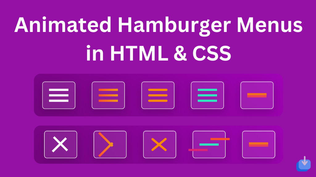
How It Work?
- Hamburger Menu 1: Classic cross animation with white bars. The bars rotate to form an “X” when clicked.
- Hamburger Menu 2: Uses a gradient color for the bars. The middle bar disappears and the others rotate on click.
- Hamburger Menu 3: Rounded-corner bars with a smooth “X” rotation effect.
- Hamburger Menu 4: Sliding bars where the top and bottom bars slide outwards on click.
- Hamburger Menu 5: Flip animation where the bars rotate in 3D space when clicked.
Step 2: CSS For Styling Humburger
					   * {
    margin: 0;
    padding: 0;
    box-sizing: border-box;
}

body {
    display: flex;
    justify-content: center;
    align-items: center;
    height: 100vh;
    background: linear-gradient(45deg, #6A0572, #A903C0);
    font-family: Arial, sans-serif;
}

.container {
    display: flex;
    gap: 30px;
    flex-wrap: wrap;
}

.menu-container {
    width: 60px;
    height: 50px;
    display: flex;
    justify-content: center;
    align-items: center;
    border: 1px solid #FFFFFF; /* White border for the container */
    border-radius: 5px;
    padding: 10px;
    background: rgba(255, 255, 255, 0.1);
    box-shadow: 0px 4px 15px rgba(0, 0, 0, 0.2);
}

/* Optional hover effect for each hamburger menu */
.menu-container:hover {
    border-color: #ff522f00;
    transition: 0.3s ease;
}

/* Hamburger Menu 1 */
.hamburger-1 div {
    width: 35px;
    height: 4px;
    background-color: white;
    margin: 6px 0;
    transition: 0.4s;
    border: 2px;
    border: #ffffff;
}

.hamburger-1.open .bar1 {
    transform: rotate(-45deg) translate(-9px, 6px);
}

.hamburger-1.open .bar2 {
    opacity: 0;
}

.hamburger-1.open .bar3 {
    transform: rotate(45deg) translate(-8px, -8px);
}

/* Hamburger Menu 2 - Gradient Bars */
.hamburger-2 div {
    width: 35px;
    height: 4px;
    margin: 6px 0;
    background: linear-gradient(to right, #FF512F, #F09819);
    transition: 0.4s;
}

.hamburger-2.open .bar1 {
    transform: rotate(45deg) translate(-5px, 6px);
}

.hamburger-2.open .bar2 {
    opacity: 0;
}

.hamburger-2.open .bar3 {
    transform: rotate(-45deg) translate(-5px, -6px);
}

/* Hamburger Menu 3 - Rounded Corners */
.hamburger-3 div {
    width: 35px;
    height: 4px;
    margin: 6px 0;
    background-color: #FF8A00;
    border-radius: 10px;
    transition: 0.4s;
}

.hamburger-3.open .bar1 {
    transform: rotate(-40deg) translate(-7px, 7px);
}

.hamburger-3.open .bar2 {
    opacity: 0;
}

.hamburger-3.open .bar3 {
    transform: rotate(40deg) translate(-7px, -7px);
}

/* Hamburger Menu 4 - Sliding Bars */
.hamburger-4 div {
    width: 35px;
    height: 4px;
    margin: 6px 0;
    background-color: #30E8BF;
    transition: transform 0.5s ease-in-out, background-color 0.3s;
}

.hamburger-4.open .bar1 {
    transform: translateX(20px);
    background-color: #FF512F;
}

.hamburger-4.open .bar3 {
    transform: translateX(-20px);
    background-color: #DD2476;
}

/* Hamburger Menu 5 - Flip Effect */
.hamburger-5 div {
    width: 35px;
    height: 4px;
    margin: 6px 0;
    background-color: #ff006a;
    transition: all 0.6s ease;
}

.hamburger-5.open .bar1 {
    transform: rotateY(180deg) translateY(12px);
    background-color: #E94057;
}

.hamburger-5.open .bar3 {
    transform: rotateY(180deg) translateY(-12px);
    background-color: #F27121;
}

.hamburger-5.open .bar2 {
    opacity: 0;
}
- Each hamburger button is a simple div structure with 3 inner
divs representing the bars. - Clicking on any menu triggers the
toggleMenu()function, which adds/removes the.openclass, triggering the CSS animations. - The CSS transitions, gradients, and animations make each menu unique.
Animated hamburger menus have changed the way we design and navigate websites. They add creativity and make the experience more engaging and user-friendly. Despite receiving criticism, with continuous improvements and updates, animated hamburger menus are here to stay and will continue to evolve. If the code doesn’t work or if you run into any issues, please leave a comment below or reach out to us through the contact page.
- Like
- Digg
- Del
- Tumblr
- VKontakte
-
- Buffer
- Love This
- Odnoklassniki
-
- Meneame
- Blogger
- Amazon
- Yahoo Mail
- Gmail
- AOL
- Newsvine
- HackerNews
- Evernote
- MySpace
- Mail.ru
- Viadeo
- Line
- Comments
- Yummly
- SMS
- Viber
-
- Subscribe
- Skype
- Facebook Messenger
- Kakao
- LiveJournal
- Yammer
- Edgar
- Fintel
- Mix
- Instapaper
- Copy Link


