
Buttons are an essential element in any website or application. They provide a way for users to interact with the content and perform actions. With the advancements in technology and web design, buttons are no longer restricted to just being a simple rectangle with text. They can now be designed in various shapes, and sizes, and with different visual effects. One such effect that has gained popularity in recent years is the glowing effect.
The glowing effect is essentially a visual effect that makes the button appear as if it has a soft, glowing aura around it. This effect is achieved by adding a subtle gradient or a light source to the button. When the user hovers over the button, the gradient or light source becomes more apparent, giving the illusion of glowing.
There are several ways to add a glowing effect to a button, but in this tutorial, we will be focusing on using CSS to create it. CSS or Cascading Style Sheets is a style sheet language used to define the design and layout of a web page. It allows developers to control various visual aspects of HTML elements, such as colors, fonts, and sizing.
This article will guide you on how to create and step-by-step guide to create glowing effect buttons using HTML and CSS.
Create Glowing Effect Buttons using HTML & CSS
Create a Folder: Start by creating a folder for your project. You can name it anything you like. Inside this folder, you’ll need to create the following files:
- index.html (for the structure of your Glowing Buttons)
- style.css (for styling the Glowing Buttons)
Create the HTML File:
- Name your HTML file index.html.
Create the CSS File:
- Name your CSS file style.css.
Step 1: Create the HTML structure
let’s create the HTML structure for our button
					<!DOCTYPE html>
<!-- NotArena || www.NotArena.com -->
<html lang="en">
<head>
    <meta charset="UTF-8">
    <meta name="viewport" content="width=device-width, initial-scale=1.0">
    <title>Glowing Buttons</title>
    <link rel="stylesheet" href="style.css">
<style id="wpr-lazyload-bg-container"></style><style id="wpr-lazyload-bg-exclusion"></style>
<noscript>
<style id="wpr-lazyload-bg-nostyle">.elementor-1911 .elementor-element.elementor-element-2e43d051::before, .elementor-1911 .elementor-element.elementor-element-2e43d051 > .elementor-background-video-container::before, .elementor-1911 .elementor-element.elementor-element-2e43d051 > .e-con-inner > .elementor-background-video-container::before, .elementor-1911 .elementor-element.elementor-element-2e43d051 > .elementor-background-slideshow::before, .elementor-1911 .elementor-element.elementor-element-2e43d051 > .e-con-inner > .elementor-background-slideshow::before, .elementor-1911 .elementor-element.elementor-element-2e43d051 > .elementor-motion-effects-container > .elementor-motion-effects-layer::before{--wpr-bg-b283082d-c12e-41a1-803b-c2cb9ede8ce0: url('https://notarena.com/wp-content/uploads/2024/10/BG.png');}.lazyloading{--wpr-bg-aed46b30-8847-4c7e-8250-9c921b0c8a8d: url('https://notarena.com/wp-content/plugins/wp-smushit/app/assets/images/smush-placeholder.png');}</style>
</noscript>
<script type="application/javascript">const rocket_pairs = [{"selector":".elementor-1911 .elementor-element.elementor-element-2e43d051, .elementor-1911 .elementor-element.elementor-element-2e43d051 > .elementor-background-video-container, .elementor-1911 .elementor-element.elementor-element-2e43d051 > .e-con-inner > .elementor-background-video-container, .elementor-1911 .elementor-element.elementor-element-2e43d051 > .elementor-background-slideshow, .elementor-1911 .elementor-element.elementor-element-2e43d051 > .e-con-inner > .elementor-background-slideshow, .elementor-1911 .elementor-element.elementor-element-2e43d051 > .elementor-motion-effects-container > .elementor-motion-effects-layer","style":".elementor-1911 .elementor-element.elementor-element-2e43d051::before, .elementor-1911 .elementor-element.elementor-element-2e43d051 > .elementor-background-video-container::before, .elementor-1911 .elementor-element.elementor-element-2e43d051 > .e-con-inner > .elementor-background-video-container::before, .elementor-1911 .elementor-element.elementor-element-2e43d051 > .elementor-background-slideshow::before, .elementor-1911 .elementor-element.elementor-element-2e43d051 > .e-con-inner > .elementor-background-slideshow::before, .elementor-1911 .elementor-element.elementor-element-2e43d051 > .elementor-motion-effects-container > .elementor-motion-effects-layer::before{--wpr-bg-b283082d-c12e-41a1-803b-c2cb9ede8ce0: url('https:\/\/notarena.com\/wp-content\/uploads\/2024\/10\/BG.png');}","hash":"b283082d-c12e-41a1-803b-c2cb9ede8ce0","url":"https:\/\/notarena.com\/wp-content\/uploads\/2024\/10\/BG.png"},{"selector":".lazyloading","style":".lazyloading{--wpr-bg-aed46b30-8847-4c7e-8250-9c921b0c8a8d: url('https:\/\/notarena.com\/wp-content\/plugins\/wp-smushit\/app\/assets\/images\/smush-placeholder.png');}","hash":"aed46b30-8847-4c7e-8250-9c921b0c8a8d","url":"https:\/\/notarena.com\/wp-content\/plugins\/wp-smushit\/app\/assets\/images\/smush-placeholder.png"}]; const rocket_excluded_pairs = [];</script></head>
<body>
    <div class="button-container">
        <a href="#" class="btn purple"> Button One </a>
        <a href="#" class="btn blue"> Button Two </a>
    </div>
<script>var rocket_beacon_data = {"ajax_url":"https:\/\/notarena.com\/wp-admin\/admin-ajax.php","nonce":"123ad984e2","url":"https:\/\/notarena.com\/code-library\/create-glowing-effect-buttons-using-html-amp-css","is_mobile":false,"width_threshold":1600,"height_threshold":700,"delay":500,"debug":null,"status":{"atf":true,"lrc":true},"elements":"img, video, picture, p, main, div, li, svg, section, header, span","lrc_threshold":1800}</script><script data-name="wpr-wpr-beacon" src='http://notarena.com/wp-content/plugins/wp-rocket/assets/js/wpr-beacon.min.js' async></script></body>
</html>
Step 2: Style the button
Create a CSS file with the name of style.css
					* {
  margin: 0;
  padding: 0;
  box-sizing: border-box;
}

body {
  display: flex;
  justify-content: center;
  align-items: center;
  min-height: 100vh;
  background-color: #1c1c1c;
  font-family: 'Arial', sans-serif;
}

.button-container {
  display: flex;
  gap: 20px;
}

.btn {
  position: relative;
  display: inline-block;
  padding: 15px 40px;
  font-size: 20px;
  color: white;
  text-decoration: none;
  text-transform: uppercase;
  border-radius: 100px;
  overflow: hidden;
  transition: 0.6s;
  letter-spacing: 2px;
  border: 2px solid transparent;
}

.btn.purple {
  background: linear-gradient(90deg, #6a11cb, #2575fc);
}

.btn.blue {
  background: linear-gradient(90deg, #00c6ff, #0072ff);
}

.btn::before {
  content: '';
  position: absolute;
  top: -50%;
  left: -50%;
  width: 200%;
  height: 200%;
  background: radial-gradient(circle, rgba(255, 255, 255, 0.2), rgba(255, 255, 255, 0));
  transform: scale(0);
  transition: transform 0.5s ease;
}

.btn:hover::before {
  transform: scale(1);
}

.btn:hover {
  border-color: white;
  box-shadow: 0 0 15px rgba(255, 255, 255, 0.5), 0 0 30px rgba(255, 255, 255, 0.3);
}

@media screen and (max-width: 768px) {
  .btn {
      font-size: 16px;
      padding: 12px 30px;
  }
}
To make the button truly appear as if it is glowing, we need to add a hover effect. When the user hovers over the button, we want the shadow to become more prominent, giving the illusion of glowing. To achieve this, we will use the `:hover` btn-hover in CSS. Add the following code to your CSS file.
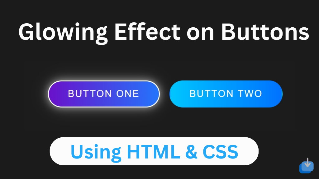
- The buttons have a glowing effect triggered by the
::beforepseudo-element. This creates a radial gradient that expands when the button is hovered over. - The
hoverstate adds a cool glow around the button, giving it a sleek and modern look. - Responsive design: The buttons adjust their size for smaller screens, making sure they remain readable and well-aligned on mobile devices.
That’s all, now you’ve successfully created a Glowing Effect Buttons using HTML and CSS. Glowing effect buttons can add an extra touch of interactivity and visual appeal to your website or application. With just a few lines of code in HTML and CSS, you can create eye-catching buttons that are sure to grab the attention of your users. In this article, we have covered the basics of creating a glowing effect using HTML and CSS, as well as some customization options. With this knowledge, you can now experiment and create your unique glowing effect buttons.
If the code doesn’t work or you encounter any errors or issues, feel free to leave a comment below or reach out to us through the contact page
- Like
- Digg
- Del
- Tumblr
- VKontakte
-
- Buffer
- Love This
- Odnoklassniki
-
- Meneame
- Blogger
- Amazon
- Yahoo Mail
- Gmail
- AOL
- Newsvine
- HackerNews
- Evernote
- MySpace
- Mail.ru
- Viadeo
- Line
- Comments
- Yummly
- SMS
- Viber
-
- Subscribe
- Skype
- Facebook Messenger
- Kakao
- LiveJournal
- Yammer
- Edgar
- Fintel
- Mix
- Instapaper
- Copy Link


