
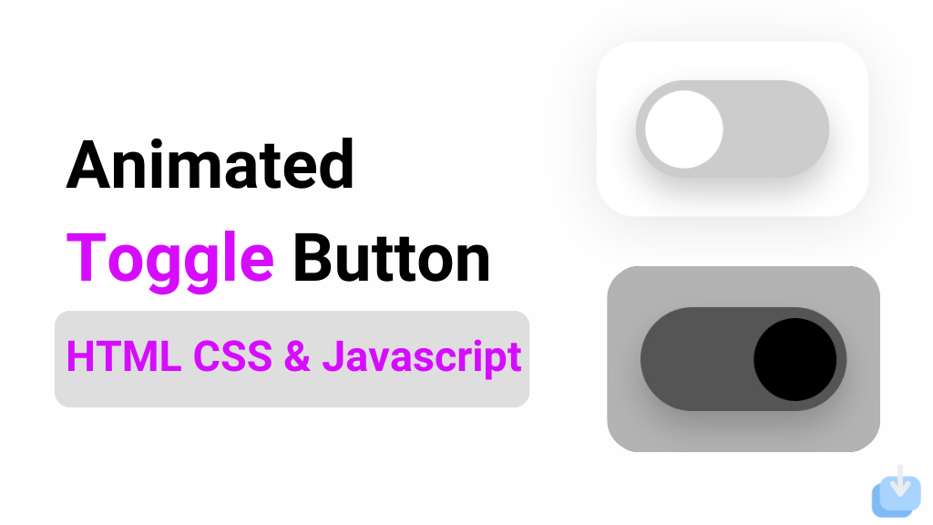
Hello! I hope you’re doing well and working on great projects. Today, I want to share an interesting project with you: an Animated Toggle Button. You will learn how to create this button using HTML, CSS, and JavaScript. What makes this toggle button special is its morphism style, which adds charm compared to a regular toggle button.
This code creates a Animated toggle button that switches between light and dark mode by adding or removing the ‘dark’ class on the body element. The toggle button has a circle that smoothly transitions to indicate the mode, and the background of the body also smoothly transitions for a seamless experience.
I am using morphism effects, the button and background have a beautiful transition that adds a touch of elegance to the toggle switch. This type of toggle button can be used in various websites or applications, especially those that may require a light and dark mode for better accessibility or just a different design option for the user.
Animate Toggle Button
To create a toggle button using HTML, CSS, and JavaScript, you need to make two files: one HTML file and one CSS file. After you create these files, you can copy and paste the provided code into them. You can also copy all the source code.
Create Toggle Button in HTML CSS & JavaScript
Create a Folder: Start by creating a folder for your project. You can name it anything you like. Inside this folder, you’ll need to create the following files:
- index.html (for the structure of your Create Toggle Button)
- style.css (for styling the Create Toggle Button)
Create the HTML File:
- Name your HTML file index.html.
Create the CSS File:
- Name your CSS file style.css.
Create the JavaScript File:
- Name your JavaScript file script.js.
					<!DOCTYPE html>
<!-- NotArena || www.NotArena.com -->
<html lang="en">
<head>
  <meta charset="UTF-8">
  <meta name="viewport" content="width=device-width, initial-scale=1.0">
  <title>Animated Toggle Button</title>
  <link rel="stylesheet" href="style.css">
<style id="wpr-lazyload-bg-container"></style><style id="wpr-lazyload-bg-exclusion"></style>
<noscript>
<style id="wpr-lazyload-bg-nostyle">.elementor-1911 .elementor-element.elementor-element-2e43d051::before, .elementor-1911 .elementor-element.elementor-element-2e43d051 > .elementor-background-video-container::before, .elementor-1911 .elementor-element.elementor-element-2e43d051 > .e-con-inner > .elementor-background-video-container::before, .elementor-1911 .elementor-element.elementor-element-2e43d051 > .elementor-background-slideshow::before, .elementor-1911 .elementor-element.elementor-element-2e43d051 > .e-con-inner > .elementor-background-slideshow::before, .elementor-1911 .elementor-element.elementor-element-2e43d051 > .elementor-motion-effects-container > .elementor-motion-effects-layer::before{--wpr-bg-205a41db-7fd5-4328-be21-e4c818dd2f42: url('https://notarena.com/wp-content/uploads/2024/10/BG.png');}.lazyloading{--wpr-bg-ff9e2418-c4ef-4900-ae36-c17899fccce7: url('https://notarena.com/wp-content/plugins/wp-smushit/app/assets/images/smush-placeholder.png');}</style>
</noscript>
<script type="application/javascript">const rocket_pairs = [{"selector":".elementor-1911 .elementor-element.elementor-element-2e43d051, .elementor-1911 .elementor-element.elementor-element-2e43d051 > .elementor-background-video-container, .elementor-1911 .elementor-element.elementor-element-2e43d051 > .e-con-inner > .elementor-background-video-container, .elementor-1911 .elementor-element.elementor-element-2e43d051 > .elementor-background-slideshow, .elementor-1911 .elementor-element.elementor-element-2e43d051 > .e-con-inner > .elementor-background-slideshow, .elementor-1911 .elementor-element.elementor-element-2e43d051 > .elementor-motion-effects-container > .elementor-motion-effects-layer","style":".elementor-1911 .elementor-element.elementor-element-2e43d051::before, .elementor-1911 .elementor-element.elementor-element-2e43d051 > .elementor-background-video-container::before, .elementor-1911 .elementor-element.elementor-element-2e43d051 > .e-con-inner > .elementor-background-video-container::before, .elementor-1911 .elementor-element.elementor-element-2e43d051 > .elementor-background-slideshow::before, .elementor-1911 .elementor-element.elementor-element-2e43d051 > .e-con-inner > .elementor-background-slideshow::before, .elementor-1911 .elementor-element.elementor-element-2e43d051 > .elementor-motion-effects-container > .elementor-motion-effects-layer::before{--wpr-bg-205a41db-7fd5-4328-be21-e4c818dd2f42: url('https:\/\/notarena.com\/wp-content\/uploads\/2024\/10\/BG.png');}","hash":"205a41db-7fd5-4328-be21-e4c818dd2f42","url":"https:\/\/notarena.com\/wp-content\/uploads\/2024\/10\/BG.png"},{"selector":".lazyloading","style":".lazyloading{--wpr-bg-ff9e2418-c4ef-4900-ae36-c17899fccce7: url('https:\/\/notarena.com\/wp-content\/plugins\/wp-smushit\/app\/assets\/images\/smush-placeholder.png');}","hash":"ff9e2418-c4ef-4900-ae36-c17899fccce7","url":"https:\/\/notarena.com\/wp-content\/plugins\/wp-smushit\/app\/assets\/images\/smush-placeholder.png"}]; const rocket_excluded_pairs = [];</script></head>
<body>
  <div class="container">
    <div class="toggle-button" id="toggle">
      <div class="toggle-circle"></div>
    </div>
  </div>

  <script>
    // Get the toggle element
const toggleButton = document.getElementById('toggle');

// Add event listener to the toggle button
toggleButton.addEventListener('click', () => {
  // Toggle dark mode class on body
  document.body.classList.toggle('dark');
});

  </script>
<script>var rocket_beacon_data = {"ajax_url":"https:\/\/notarena.com\/wp-admin\/admin-ajax.php","nonce":"123ad984e2","url":"https:\/\/notarena.com\/code-library\/create-toggle-button-in-html-css-amp-javascript","is_mobile":false,"width_threshold":1600,"height_threshold":700,"delay":500,"debug":null,"status":{"atf":true,"lrc":true},"elements":"img, video, picture, p, main, div, li, svg, section, header, span","lrc_threshold":1800}</script><script data-name="wpr-wpr-beacon" src='http://notarena.com/wp-content/plugins/wp-rocket/assets/js/wpr-beacon.min.js' async></script></body>
</html>
Create two CSS classes for the button, one for light mode and one for dark mode. Add properties such as width, height, border-radius, and background color to customize the button’s appearance.
* {
  margin: 0;
  padding: 0;
  box-sizing: border-box;
}

/* Full screen setup */
body {
  display: flex;
  justify-content: center;
  align-items: center;
  height: 100vh;
  background-color: white;
  transition: background-color 0.5s ease;
}

/* Container for the toggle button */
.container {
  display: flex;
  justify-content: center;
  align-items: center;
  padding: 20px;
  border-radius: 20px;
  background: rgba(255, 255, 255, 0.7);
  box-shadow: 0 4px 30px rgba(0, 0, 0, 0.1);
  backdrop-filter: blur(10px);
}

/* Toggle button styling */
.toggle-button {
  width: 100px;
  height: 50px;
  background-color: #ccc;
  border-radius: 50px;
  padding: 5px;
  display: flex;
  align-items: center;
  cursor: pointer;
  position: relative;
  transition: background-color 0.5s ease;
  box-shadow: 0px 8px 15px rgba(0, 0, 0, 0.2);
}

/* Circle inside the toggle */
.toggle-circle {
  width: 40px;
  height: 40px;
  background-color: white;
  border-radius: 50%;
  position: absolute;
  top: 5px;
  left: 5px;
  transition: all 0.5s ease;
}

/* Dark mode background */
body.dark {
  background-color: black;
}

/* Dark mode toggle button */
body.dark .toggle-button {
  background-color: #555;
}

/* Dark mode toggle circle */
body.dark .toggle-circle {
  background-color: black;
  left: 55px;
}
HTML:
- A simple toggle button inside a container div.
- The button has a circle that will slide left and right to indicate light/dark mode.
CSS:
- Body transitions between light and dark backgrounds using the .dark class.
- The .toggle button changes the background colour in dark mode.
- The .toggle-circle slides left or right when switching modes, using a smooth transition.
- The styling includes a morphism effect for the background, with a blur and soft shadow, making it visually appealing.
JavaScript:
- The JavaScript simply toggles the dark class on the body element when the button is clicked, which triggers the CSS transitions.
If the code doesn’t work or if you run into any issues, please leave a comment below or reach out to us through the contact page.
- Like
- Digg
- Del
- Tumblr
- VKontakte
-
- Buffer
- Love This
- Odnoklassniki
-
- Meneame
- Blogger
- Amazon
- Yahoo Mail
- Gmail
- AOL
- Newsvine
- HackerNews
- Evernote
- MySpace
- Mail.ru
- Viadeo
- Line
- Comments
- Yummly
- SMS
- Viber
-
- Subscribe
- Skype
- Facebook Messenger
- Kakao
- LiveJournal
- Yammer
- Edgar
- Fintel
- Mix
- Instapaper
- Copy Link


