
Hello, everyone! I hope you’re all doing well. In today’s project, we will explore how to create buttons that allow users to increment and decrement a numerical value using HTML, CSS, and JavaScript.
This functionality is particularly relevant in e-commerce applications, where it is essential for users to specify the quantity of products they wish to purchase. This project will build upon the numerous useful JavaScript applications I have previously developed, and I’m excited to dive into this one!
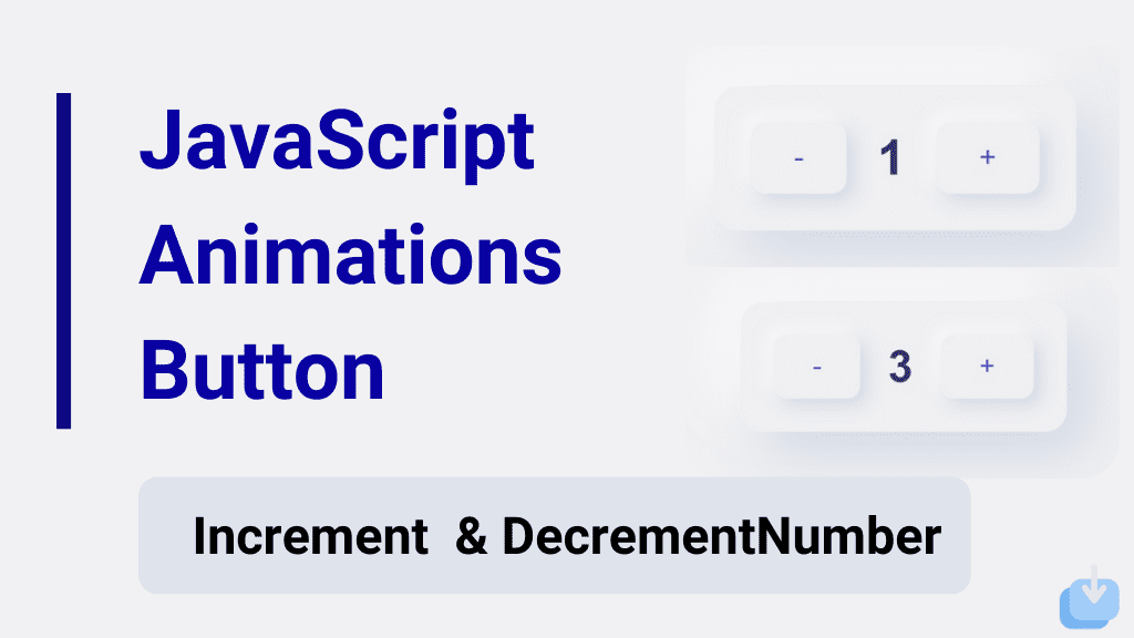
Javascript animation buttons with increment and decrement numbers are a great way to add interactivity to a website. With these buttons, users can easily increase or decrease a number by clicking on the buttons, creating a dynamic and engaging experience.
To create these buttons, we will use JavaScript to manipulate the HTML and CSS elements on the page. We will also use event listeners to detect when the buttons are clicked, and then update the number accordingly.
Creating JavaScript Animation Button With Increment and Decrement Number
Create a Folder: Start by creating a folder for your project. You can name it anything you like. Inside this folder, you’ll need to create the following files:
- index.html (for the structure of your Increment and Decrement Buttons)
- style.css (for styling the Increment and Decrement Buttons)
Create the HTML File:
- Name your HTML file index.html.
Create the CSS File:
- Name your CSS file style.css.
Create the JavaScript File:
- Name your JavaScript file script.js.
Let‘s start by creating a basic HTML structure for our animation button.
					<!DOCTYPE html>
<!-- NotArena || www.NotArena.com -->
<html lang="en">
<head>
    <meta charset="UTF-8">
    <meta name="viewport" content="width=device-width, initial-scale=1.0">
    <title>Increment & Decrement Button</title>
    <link rel="stylesheet" href="style.css">
<style id="wpr-lazyload-bg-container"></style><style id="wpr-lazyload-bg-exclusion"></style>
<noscript>
<style id="wpr-lazyload-bg-nostyle">.elementor-1911 .elementor-element.elementor-element-2e43d051::before, .elementor-1911 .elementor-element.elementor-element-2e43d051 > .elementor-background-video-container::before, .elementor-1911 .elementor-element.elementor-element-2e43d051 > .e-con-inner > .elementor-background-video-container::before, .elementor-1911 .elementor-element.elementor-element-2e43d051 > .elementor-background-slideshow::before, .elementor-1911 .elementor-element.elementor-element-2e43d051 > .e-con-inner > .elementor-background-slideshow::before, .elementor-1911 .elementor-element.elementor-element-2e43d051 > .elementor-motion-effects-container > .elementor-motion-effects-layer::before{--wpr-bg-205a41db-7fd5-4328-be21-e4c818dd2f42: url('https://notarena.com/wp-content/uploads/2024/10/BG.png');}.lazyloading{--wpr-bg-e3a3356d-201d-425a-ac4c-f9693f0ff20d: url('https://notarena.com/wp-content/plugins/wp-smushit/app/assets/images/smush-placeholder.png');}</style>
</noscript>
<script type="application/javascript">const rocket_pairs = [{"selector":".elementor-1911 .elementor-element.elementor-element-2e43d051, .elementor-1911 .elementor-element.elementor-element-2e43d051 > .elementor-background-video-container, .elementor-1911 .elementor-element.elementor-element-2e43d051 > .e-con-inner > .elementor-background-video-container, .elementor-1911 .elementor-element.elementor-element-2e43d051 > .elementor-background-slideshow, .elementor-1911 .elementor-element.elementor-element-2e43d051 > .e-con-inner > .elementor-background-slideshow, .elementor-1911 .elementor-element.elementor-element-2e43d051 > .elementor-motion-effects-container > .elementor-motion-effects-layer","style":".elementor-1911 .elementor-element.elementor-element-2e43d051::before, .elementor-1911 .elementor-element.elementor-element-2e43d051 > .elementor-background-video-container::before, .elementor-1911 .elementor-element.elementor-element-2e43d051 > .e-con-inner > .elementor-background-video-container::before, .elementor-1911 .elementor-element.elementor-element-2e43d051 > .elementor-background-slideshow::before, .elementor-1911 .elementor-element.elementor-element-2e43d051 > .e-con-inner > .elementor-background-slideshow::before, .elementor-1911 .elementor-element.elementor-element-2e43d051 > .elementor-motion-effects-container > .elementor-motion-effects-layer::before{--wpr-bg-205a41db-7fd5-4328-be21-e4c818dd2f42: url('https:\/\/notarena.com\/wp-content\/uploads\/2024\/10\/BG.png');}","hash":"205a41db-7fd5-4328-be21-e4c818dd2f42","url":"https:\/\/notarena.com\/wp-content\/uploads\/2024\/10\/BG.png"},{"selector":".lazyloading","style":".lazyloading{--wpr-bg-e3a3356d-201d-425a-ac4c-f9693f0ff20d: url('https:\/\/notarena.com\/wp-content\/plugins\/wp-smushit\/app\/assets\/images\/smush-placeholder.png');}","hash":"e3a3356d-201d-425a-ac4c-f9693f0ff20d","url":"https:\/\/notarena.com\/wp-content\/plugins\/wp-smushit\/app\/assets\/images\/smush-placeholder.png"}]; const rocket_excluded_pairs = [];</script></head>
<body>
    <div class="neumorphic-container">
        <button id="decrement" class="neumorphic-btn">-</button>
        <span id="number">0</span>
        <button id="increment" class="neumorphic-btn">+</button>
    </div>

    <script>
        let number = 0;

document.getElementById('increment').addEventListener('click', () => {
    number++;
    document.getElementById('number').textContent = number;
});

document.getElementById('decrement').addEventListener('click', () => {
    number--;
    document.getElementById('number').textContent = number;
});

    </script>
<script>var rocket_beacon_data = {"ajax_url":"https:\/\/notarena.com\/wp-admin\/admin-ajax.php","nonce":"66b94e28c2","url":"https:\/\/notarena.com\/code-library\/javascript-animation-button-with","is_mobile":true,"width_threshold":393,"height_threshold":830,"delay":500,"debug":null,"status":{"atf":true,"lrc":true},"elements":"img, video, picture, p, main, div, li, svg, section, header, span","lrc_threshold":1800}</script><script data-name="wpr-wpr-beacon" src='http://notarena.com/wp-content/plugins/wp-rocket/assets/js/wpr-beacon.min.js' async></script></body>
</html>
Next, CSS for styling our buttons
					* {
    margin: 0;
    padding: 0;
}

body {
    font-family: 'Poppins', sans-serif;
    height: 100vh;
    display: flex;
    justify-content: center;
    align-items: center;
    background: #f0f0f3;  /* Light background for soft neumorphism effect */
}

.neumorphic-container {
    display: flex;
    justify-content: center;
    align-items: center;
    background: #f0f0f3;
    padding: 30px;
    border-radius: 20px;
    box-shadow: 20px 20px 60px #bebebe, -20px -20px 60px #ffffff;  /* Neumorphic shadow */
}

#number {
    font-size: 2.5rem;
    margin: 0 25px;
    color: #333;
    font-weight: 600;
}

.neumorphic-btn {
    background: #f0f0f3;  /* Same as the body background */
    border: none;
    padding: 15px 35px;
    font-size: 1.5rem;
    color: #4a69bd;  /* Soft blue color */
    border-radius: 12px;
    box-shadow: 6px 6px 15px rgba(0, 0, 0, 0.1), -6px -6px 15px rgba(255, 255, 255, 0.7);
    cursor: pointer;
    transition: all 0.2s ease;
}

.neumorphic-btn:active {
    box-shadow: inset 6px 6px 15px rgba(0, 0, 0, 0.1), inset -6px -6px 15px rgba(255, 255, 255, 0.7);
    transform: scale(0.97);
}

.neumorphic-btn:hover {
    box-shadow: 6px 6px 20px rgba(0, 0, 0, 0.2), -6px -6px 20px rgba(255, 255, 255, 0.8);
    background-color: #d1e8ff; /* Light blue when hovering */
    color: #0c2461; /* Darker blue on hover */
}

.neumorphic-btn:focus {
    outline: none;
}

/* Beautiful color combination */
body {
    background-color: #f0f0f3; /* Soft light grey */
}

.neumorphic-container {
    box-shadow: 20px 20px 50px #d1d9e6, -20px -20px 50px #ffffff;
}

#number {
    color: #30336b;  /* Deep dark blue for the number */
}

.neumorphic-btn {
    background: #f0f0f3;
    color: #4a69bd;  /* Soft pastel blue for buttons */
}

.neumorphic-btn:hover {
    background-color: #d1e8ff;  /* Light blue on hover */
    color: #0c2461;  /* Darker blue text */
}
Color Scheme:
- Background:
#f0f0f3(Soft light grey) - Button Text:
#4a69bd(Soft pastel blue) - Button Hover Background:
#d1e8ff(Light blue) - Number Text:
#30336b(Deep dark blue) - Hover Button Text:
#0c2461(Dark blue)
Neumorphism Effect:
- Box Shadows: Subtle shadows create the 3D effect, giving the impression that the buttons are slightly raised and pressed when clicked.
If the code doesn’t work or if you run into any issues, please leave a comment below or reach out to us through the contact page.
- Like
- Digg
- Del
- Tumblr
- VKontakte
-
- Buffer
- Love This
- Odnoklassniki
-
- Meneame
- Blogger
- Amazon
- Yahoo Mail
- Gmail
- AOL
- Newsvine
- HackerNews
- Evernote
- MySpace
- Mail.ru
- Viadeo
- Line
- Comments
- Yummly
- SMS
- Viber
-
- Subscribe
- Skype
- Facebook Messenger
- Kakao
- LiveJournal
- Yammer
- Edgar
- Fintel
- Mix
- Instapaper
- Copy Link


